anna-LoopReading

I decided to take a look at the text article instead of the video. I like the way it begins by articulating the importance of the GIF in today’s culture, despite its reputation as something immature. When it moves past the Coraline trailer in its discussion of looping images on public transit, I question, “was this the work Golan intended to show us earlier, but he couldn’t find the exact documentation of it he was looking for?” but perhaps that is not it, as, like, I’m sure there are multiple “animations” that exist in transit tunnels. I like how the author states that frame-by-frame depictions are a way of offloading information onto a page. The article describes hypnosis and then exposure therapy–the discussion of the former made me consider the implications of EMDR therapy.

I’m sorry, I know this is a lot I’ll end it here?
anna-Readings03

I’m finding Hobbs’s intention to put specific varieties of colors at either the tops or bottoms of his works visually intriguing in concept and quite mentally relaxing in execution.

Meanwhile, the other article’s visual representation of the RGB color system reminds me of how truly atrocious it is, and yet, how much RGB is like, the cornerstone of all digital colors. HSV and HSL continue to confuse me, but a little less so after seeing them both laid out like this.

anna-wallpaper

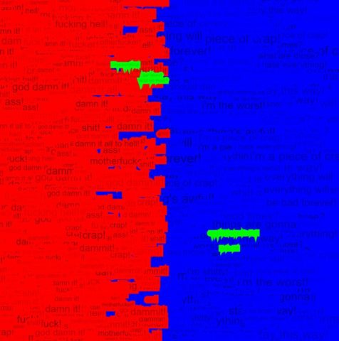
I wanted to make a wallpaper that utilized strings of mood-relevant text and the blaring colors of RBG defaults to exemplify three extremes of emotional thinking and the chaos they create. I wanted it to be something that looks unmanageable on the surface, but whose essence is really laid out bare in the code re: text sizing and the text itself.

Red: anger

Green: (fleeting, but distinct) happiness

Blue: sadness

You might want to look at the sketch here, as the image isn’t the best.

Here’s a version of my piece as it appeared in a myScaledCanvas version of the file, with a few tweaks to make it suitable for larger sizes–I couldn’t quite get the export function to work, but wanted to provide an image nonetheless.

Find the code here.

anna-LookingOutwardsD02

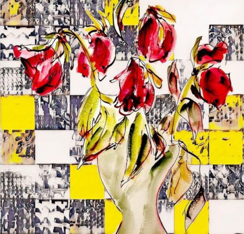
generated image of red flowers in a vase

I find this particular image from Helena Sarin intriguing in that I don’t want to believe it’s generated–I want to believe this is a painting, with brushes and existence outside a screen and all, like so many other images of flowers in vases I’ve seen; to have to grapple with the fact that it is not that makes me frustrated in an interesting way, so I thought maybe I could share that feeling with another viewer by choosing this as my post.

anna-reading02

Kate Compton’s “One Thousand Bowls of Oatmeal” problem refers to the ways in which one must account for human perception when making a generator that might make things that are technically unique, but not so to the human eye. The author raises the concepts of perceptual differentiation and perceptual uniqueness as two ways by which she explains this “problem”–the former being an object’s differentiation from its iterated predecessor, the latter being a sense of “personality” about an object; does it stand on its own against the whole body of objects? Striving for perceptual uniqueness would lead me to try and create different “archetypes” for whatever I would be generating–perhaps making it so that an object is made either of cool or warm colors, has rounded or sharp edges, or is against a light or dark background.