fr0g.fartz-Restrictions of Comfort

Try it here.

TW: anxiety

This project is about having anxiety. One experience with anxiety that I have that has felt very real for me is the debate of whether I should stay in bed or not. I feel safe in my bed and in my room, more than anywhere else. This is because I know that very few dangerous things could happen to me in my room. However, this idea turns ugly when the thoughts start to force me to stay in bed and feel very afraid of the possibility of going out into the world. It is hard to explain the logic behind these thoughts, as they are irrational.

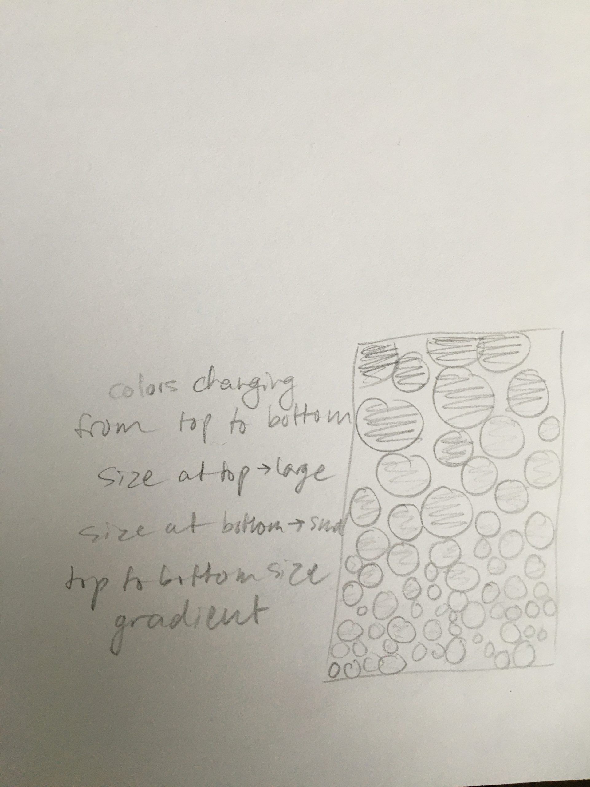
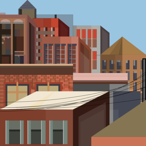
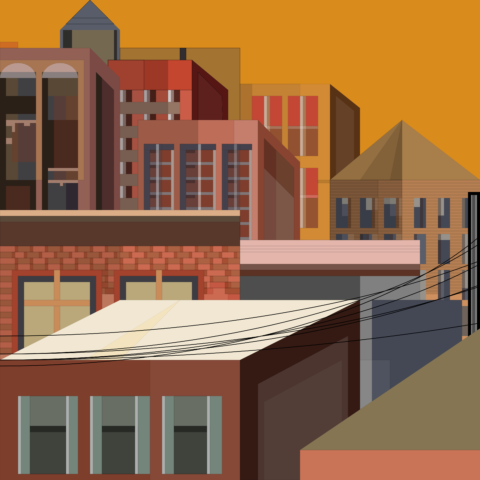
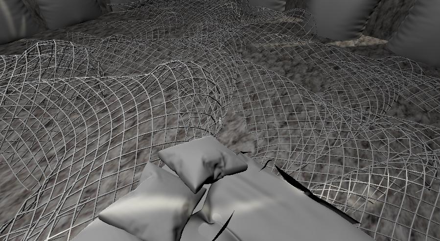
My project is not totally a “game,” because the viewer is trapped in the bed. I wanted to create a visual for what it feels like for me to not be able to leave my room, almost as if the room is convincing me to stay in it. The pillow-covered knit walls give a sense of security and delight, like the posters in my own bedroom. However, the wires on the bedroom floor prevent the viewer from stepping anywhere besides the bed. The bed is small and centred in the middle of the room, adding to a feeling of dissociation. The wired roof allows for the anxious viewer to look outside, without actually being outside, a common safety hazard prevention for me. The variation in the darkness of the neutral colors also adds to a conflicting feeling. The bed and pillows are light, indicating happiness, however, there are dark shadows behind them.

The intention of this project was for me to embrace this feeling of anxiety, by making it into art, or something visual. When anxiety can be brought outside of the head and into physicality, it can be seen for what it is. Making and sharing this project has provided consolation for me.

03-Readings

I really liked learning about the differences between HSL and RGB because I think both can be advantageous for different types of projects. It’s also fun because as an artist who already understands color theory, it’s something that I can play around with efficiently. As for the Tyler Hobbs article, I got a lot of great inspiration on how to use color generatively. I particularly love the look of the “compositional shapes” design. (attached)

YoungLee- Wallpaper

Code

Process:
I separated the project into 4 parts: creating the nested for loop, setting up the randomized fonts, setting up the randomized colors, and randomizing its properties. My final product wasn’t what I first had in mind. I actually wanted to create a random gradient regarding the size of each letter. I tried to replicate the random gradient in the example but just couldn’t seem to get it right. Although I didn’t succeed in creating the product that I wanted, I learned how to randomize things, such as fonts, color, etc., in a nest for Loop. In the future, I want to completely understand how to do a random gradient for the rotation of my text and the size of my text.

Inspiration/Color palette:


I also found this video helpful:
https://youtu.be/7GwhYcUqypk

bookooBread – Wallpaper

Final version (high res didn’t upload for first one):

I like this darker color palette better, for some reason when it exported the colors changed and I love it

Version 2: Experimenting with color variation and circle packing (left has ellipse grid, right does not)

Version 1: Primary colors and size gradient

This design actually was inspired by what I made for the repeated motif exercise. I coded these radial lines on the circles and thought it looked super cool. I took that basic premise and turned it into something completely different. After all of the circles were created, I wanted another layer to add depth to the pattern. With another double for-loop, I created randomly sized ellipses to cover the entire image… I really liked how it looked together.

I did not actually start from a sketch with this wallpaper, though I did plan a bit after I had my idea. After that, there was a lot of experimenting and pleasant surprises. Originally I like the idea of the size gradient in the first version, but I personally didn’t love how crowded it felt. So I wanted to try out a circle packing design. With Connie’s help, we wrote the circle packing algorithm and then I merged my code with the new code. I shifted the color randomness around until it became what it is in the last version, and fixed a bug with the radial lines on the circles. I really like how it came out! It kind of reminds me of a Persian rug in my living room at home. If I had more time I would’ve loved to take up Golan’s challenge to make all of the circles irregular. Sadly, I could not do this by today but I will try it in the future!

anna-Readings03

I’m finding Hobbs’s intention to put specific varieties of colors at either the tops or bottoms of his works visually intriguing in concept and quite mentally relaxing in execution.

Meanwhile, the other article’s visual representation of the RGB color system reminds me of how truly atrocious it is, and yet, how much RGB is like, the cornerstone of all digital colors. HSV and HSL continue to confuse me, but a little less so after seeing them both laid out like this.

anna-wallpaper

I wanted to make a wallpaper that utilized strings of mood-relevant text and the blaring colors of RBG defaults to exemplify three extremes of emotional thinking and the chaos they create. I wanted it to be something that looks unmanageable on the surface, but whose essence is really laid out bare in the code re: text sizing and the text itself.

Red: anger

Green: (fleeting, but distinct) happiness

Blue: sadness

You might want to look at the sketch here, as the image isn’t the best.

Here’s a version of my piece as it appeared in a myScaledCanvas version of the file, with a few tweaks to make it suitable for larger sizes–I couldn’t quite get the export function to work, but wanted to provide an image nonetheless.

Find the code here.

bookooBread-Readings03

After reading Tyler Hobbs’s Color in Generative Art, I was super inspired to try out some of the things he talks about. I took the idea of a gradient but applied it a bit differently. Instead of doing a color gradient, I did a size gradient. I think above all however, I was the most inspired by all the other blog posts on the side of the site. I went down a bit of a rabbit hole and read about a third of all of his posts… After really loving all of the sketches from the flow fields blog post I decided to look into it myself to see if I could use that for my wallpaper and went down an even deeper rabbit hole and watched the entire perlin noise series on The Coding Train youtube. I talked with Golan and decided not to go down this route for my wallpaper, but I am still super happy I learned about all of these things and I’m very excited to experiment with them in the future (especially flow fields – I feel like I always resonate with flowy, more abstract visuals).

Monday – Wallpaper

Wallpaper sketch

I based the palette of this wallpaper off of an image I took of some leaves at a park and wanted to create random blossoming shapes to form a more organic look. I ultimately used 1D perlin noise to create variation in the lengths of the “petals” of the shapes and layered them in multiple colors to create more contrast. Lastly, I arranged them in staggered paths and left room for negative space to balance everything out.

Original image:

Process Photos:

rathesungod – Wallpaper


This is my first landscape or (cityscape) wallpaper.  So after my generative wallpaper wasn’t exactly hitting the spot, I went back to my original plan before the assignment was altered. I wanted to create a warm toned cityscape that specifically reminds me of summer 2019 of different time stamps.

Here’s a quick sketch that I did before I started:

Generative Wallpaper (kinda fail)

This was my first generative wallpaper that I had made. My goals were to achieve lots of color with different elements and shapes that connected with each other. I created four versions with the following colors:

After finishing this wallpaper, I found myself stuck with the design and didn’t really like the final product. I also made a lot of altering versions of this wallpaper but none of them stuck out to me. But I was satisfied with the colors and how I learned new techniques with making pattern.