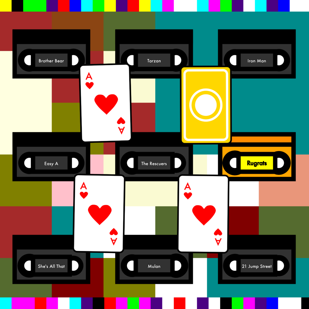
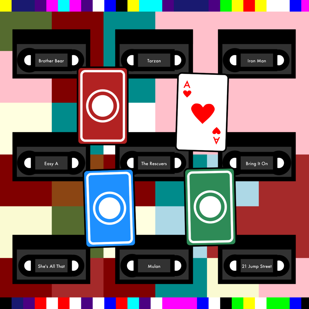
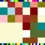
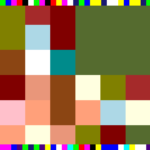
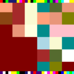
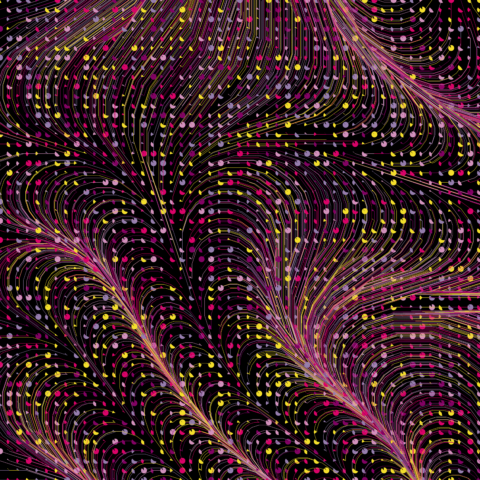
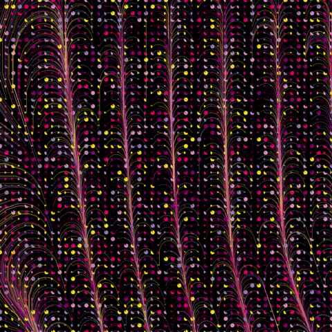
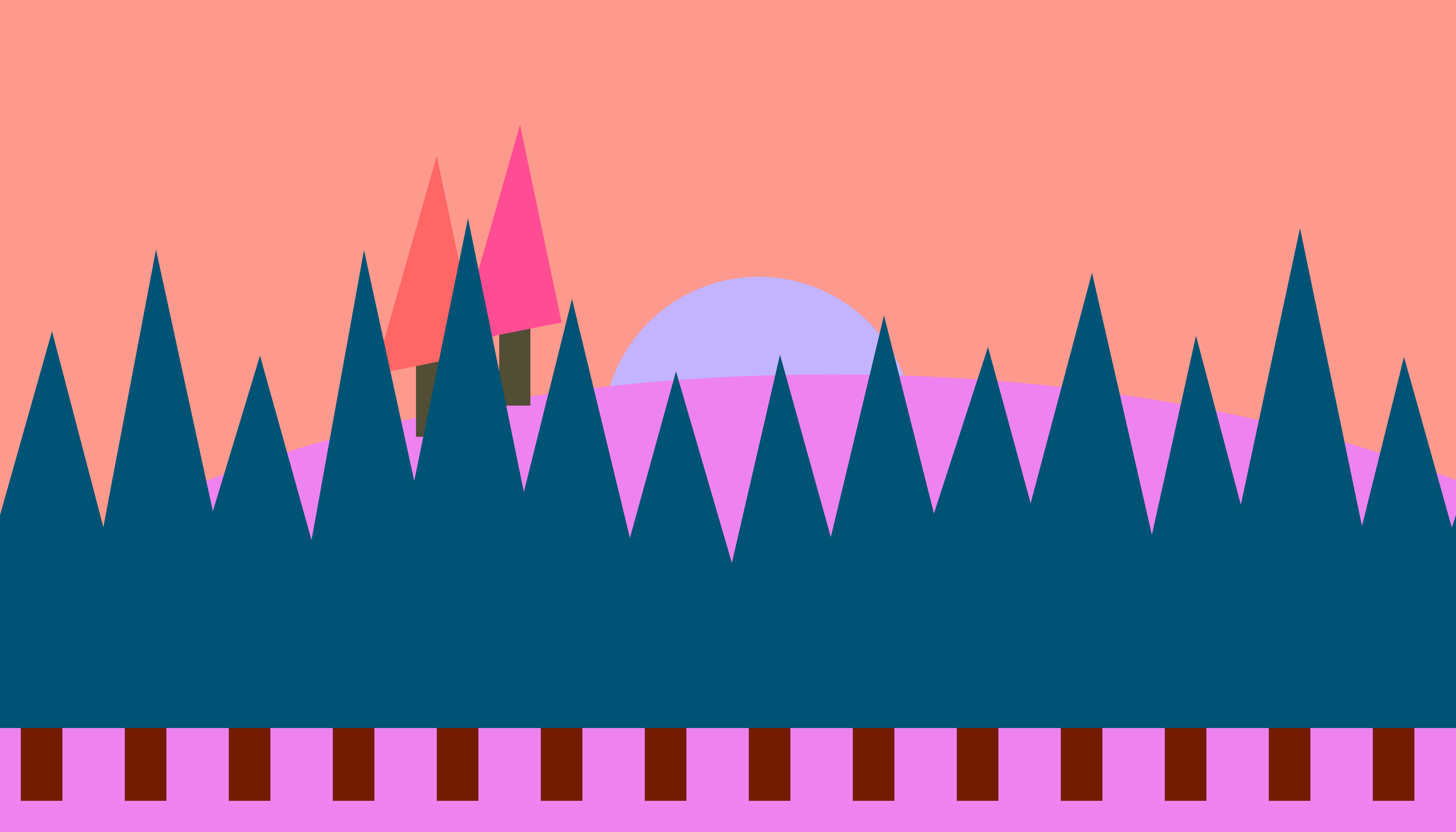
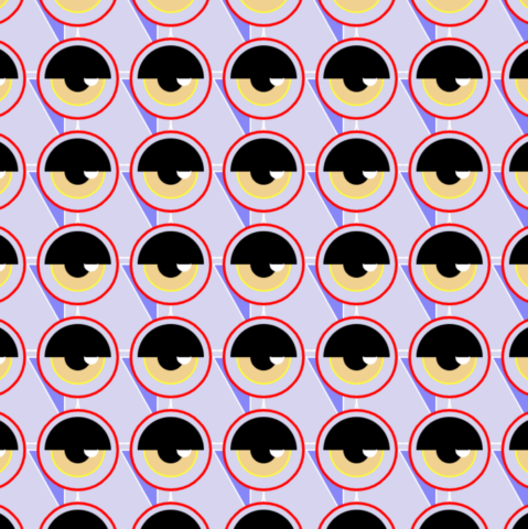
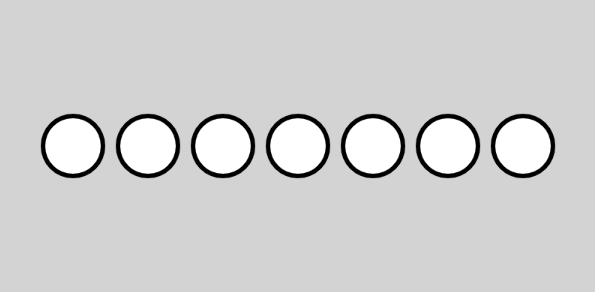
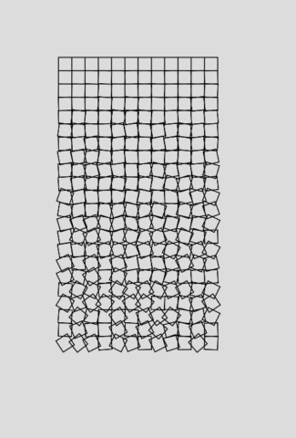
minniebzrg-03-Wallpaper

Minnie’s Wallpaper

Code

highRes code

This is a geometric wallpaper. To be honest, I was getting quite frustrated and confused when making a different wallpaper before. After starting over 5 times, I decided to do something simple that would help me understand how coding works. This wallpaper is not the greatest. It’s not the most exciting or rememberable. However, I had to look at the assignment from a simpler perspective.

Process:

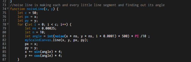
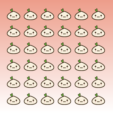
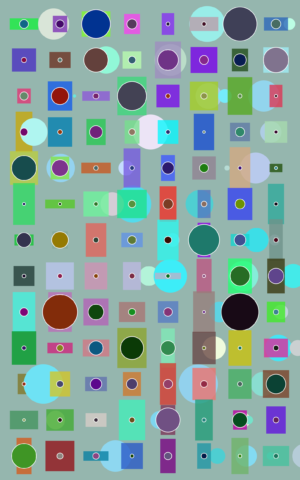
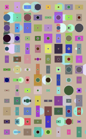
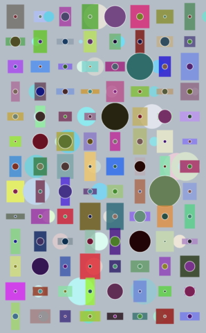
First I created two simple shapes, rect() and circle(). I wrote down exactly what functions would be needed so I could work with written code instead of imagination. Then I created a for()loop. I used variables i and j for the x and y coordinates.  I added a wider additive  (i+60) than the width of the original square (width was 50) so that there would be limited overlapping.  From here I could make any necessary changes with the random function for the width and height of the rect and circle. The next step was color. This took the longest time because I had different values for each group of shapes. I used a color picker to choose specifically which range of colors I wanted. Then when I wanted a more random placement of the second set of circles, I tinkered with the code and used random() again.

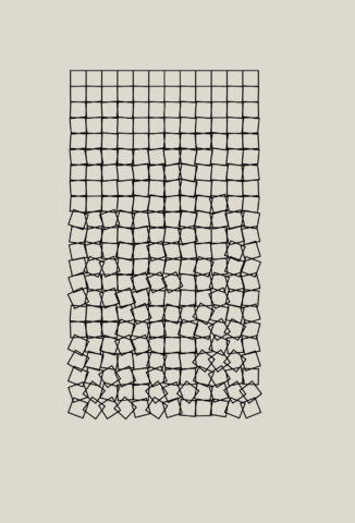
From the suggestions, I was able to implement a few.

  • Rhythm
  • Scale: I used variable and the random tool to produce shapes at different sizes.
  • Background, middleground, foreground: I would say the three shapes play around with this concept of layering.
  • Infrequent features: toward the end of the code, I decided I wanted to move some shapes around to a random location. Now that I had a better understanding of how variables work, I tweaked the x coordinate of the second set of circles so that it was still in relation to the variable I. I was surprisingly glad to see that it worked.
  • Color: I played around with variables to define a color range. It hurt my brain a little to try to understand it, but I think the commenting in the code helped me.  I was going for a muted color palette and it seems to have worked somewhat well.
  • Randomness: the randomness is specifically in the sizing, color, and placement.
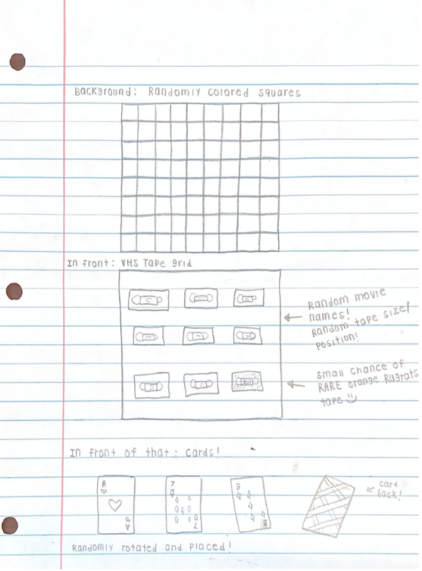
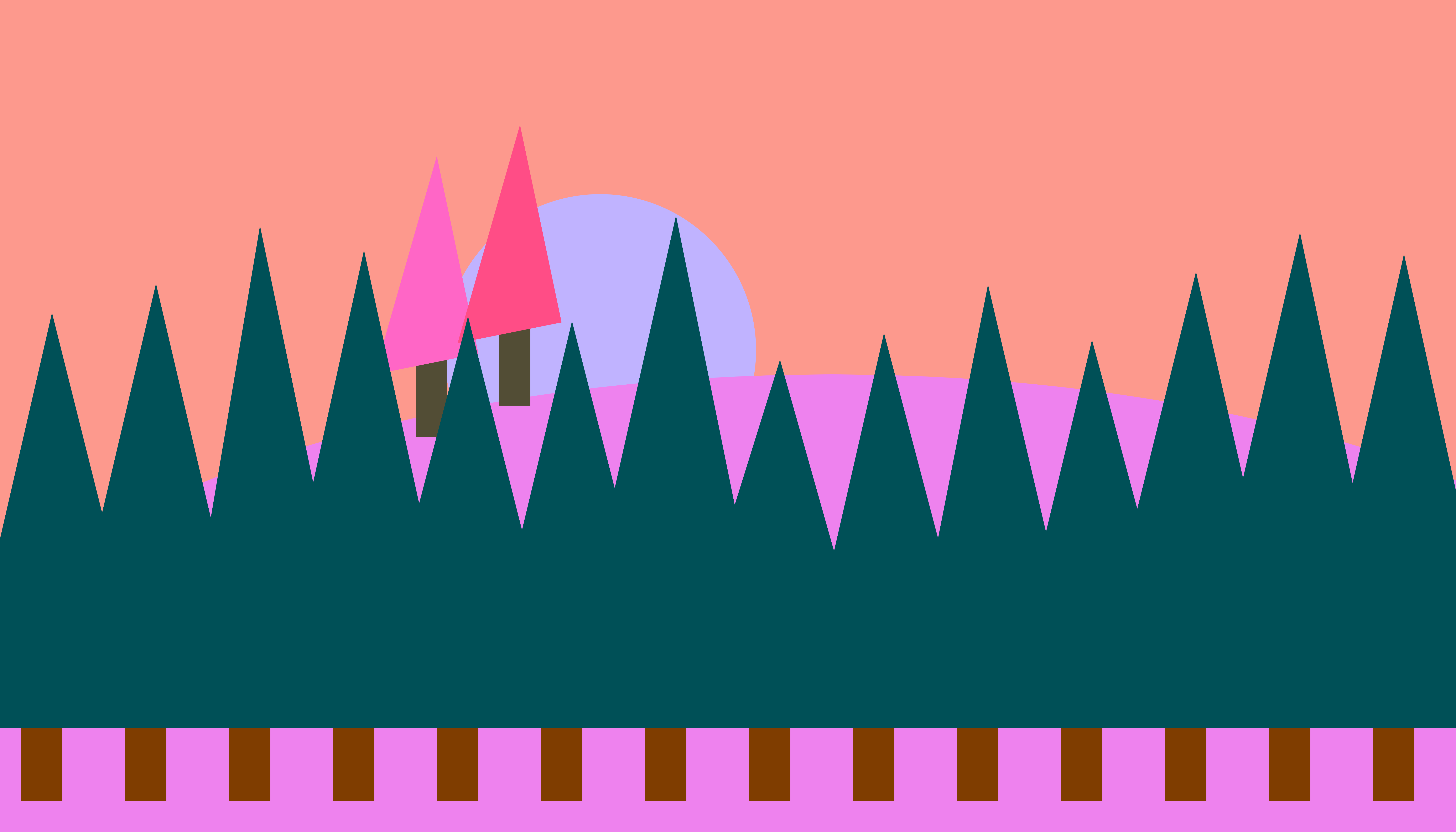
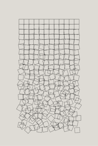
Sketch:

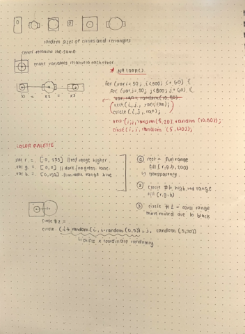
This is a sketch based off an idea I had.  I wanted the square and circle to have the same origin/center point so I drew what I knew had to occur first. This helped me understand what the code might produce.  I knew that the distance between each center point had to be a fixed number. This would become a variable I use in the code. An important function I use is rectMode(CENTER), which we learned and it was very useful. I had to learn what noLoop() meant so that it wouldn’t keep looping each time I pressed start.

minniebzrg-03Readings

Rune Madsen, Color Models and Color Spaces

I learned from this article that the CIEXYZ color space model displays the color range of many other modern color spaces. If the color space of whatever screen you are using has a different range to the intended color space, then some colors might not be visible. The RGB, HSL, HSV color spaces are all in the range of the sRGB color space. In p5js, I learned that color mode ranges can be changed as well. This means I can choose a number based on a different scale than the original model has.

Tyler Hobbs, Color in Generative Art

I like that Hobbs challenges the reader to discover their own knack for generating color palettes. The intro paragraph spoke directly to me because my wallpaper code became difficult when deciding how to randomize the colors without producing a bunch of palettes that just didn’t work together. I learned about sorting colors based on clustering, shapes, tones, probability, and more. He says that good color is “about placing them strategically,” which I hope to learn more about and use to expand my future artwork.

bumble_b – Wallpaper

Note: The high-res code seems to sort of glitch with my tape names because they won’t randomize if you just click on the image instead of pressing play again. So, I’ve now noticed that the tape names are exactly the same in these two images, but they DO randomize! 🙂

My final pattern:

Code

Initial Sketches:

My idea was to do cards and tapes (two of my favorite things in the world), with a randomly colored square background and some random chances of variations happening.

In the end, I wound up with the square background I planned, but I made one large square for dynamics and a top and bottom border of smaller squares (with the “no TV signal” color palette). The colors randomly generate from palettes and the large square has different potential positions.

My tapes also are all randomly named with random tape sizes/positions! This worked out really well and almost exactly how I visualized it except that I couldn’t find out how to do multiple lines of text (line breaks), so I ended up only getting to choose movies with short titles.

I also used an if/else statement for the small chance of an orange Rugrats tape showing up!

For my cards, I sort of ran into trouble because placing all the different small shapes to make different card numbers was getting really time consuming, so I had to change up my concept a lot. Instead of one deck of cards with random cards showing up, I ended up with 4 different sets of cards with all ace of heart cards. To make it look a little more intentional, I made the randomly chanced card backs 4 different colors, so it will always look like 4 different sets (making the 4 ace of heart cards make more sense)!

I really like my pattern and would LOVE this wallpaper with all my favorite movie titles in my future basement. I really love clutter and having a lot of things going on, so this really fits my style. I do think my design isn’t all that interesting in its variations, though. It’s all very predictable in the element positions, really only changing colors and text. I think if I were to start over, I would focus on a more abstract design with lots of wild variations, sort of like how my background on its own looked:


shrugbread-Wallpaper

My Code: https://editor.p5js.org/shrugbread/sketches/XnztQHwKK


The code that I used to make this wallpaper was modified from Okazz_ on OpenProcessing. Below is an image of the original work.

Okazz_ sketch: https://www.openprocessing.org/sketch/825210

The code that governs the lines and dots of the wallpaper is very simple but requires that the programmer know how noise functions work, as well as how to creatively apply what the noise function will give you.


Above is the code that controls my lines. By fiddling with the numbers I figured out that the parameters within noise() are dictating the intensity, shape, and detail and of the Perlin noise. Said noise function is then multiplied and blown up now that it has been properly defined and detailed for it to be visually variable. Noise () is then multiplied by the int() command forcing whatever value that the noise function produces to round to the nearest integer. The lines that start with x+= and y+= then use the result of the angle variable to determine the direction that the line will continue going.  The specifics of the math still escape me after multiple explanations but after a few hours of playing with the numbers, I was able to get the lines to travel in parallel squares or bunch up at their original gridpoints, as well as many other fun tricks.
The noiseLine function was not the only change I made to the original Okazz_ sketch.  Instead of multicolored squares as my gridpoints, I used arcs with randomized starting angles. I also edited the color range used, and have a commented-out grayscale array for the pallette. I spent very long trying to make this as interesting-looking as possible and ended up with some even crazier results, but I found this variation to be the most appealing.

peatmoss-Wallpaper


EDITED 2/22/2o (so close): 

With Golan’s help I made a far prettier version utilizing a handful of for loops!

Code: https://editor.p5js.org/noonmarkart/sketches/VjdZmNBJq


Code: https://editor.p5js.org/noonmarkart/sketches/ITlYulo05

Landscape Wallpaper Exports:

My process was essentially hours full of low-grade panic, and hrm’ing about trying to make the for loop at the bottom look anything like trees. Once I got there to be SHAPES! (hallelujah), I worked on getting the HSB palette of the piece to be something pretty and pleasing, since I know the shapes are…odd. With the help of Connie I worked on randomizing the hue and brightness of the for loop trees at the bottom, and I set the ‘sun’, ‘moon’, or ever watching Sky Orb (its up to interpretation), to be a random position each time. In the future I’d like to figure out with more confidence how to do a function to make the trees so it can be more thoroughly randomized, and have more varying parts!

My initial thought for this project was to have there be an additive multiply blendMode on the piece, making it so that as the cloud1 and cloud2 variable circles blotted out over the background, they’d make things go darker like dusk was falling. This was not a good idea in the end, but I did record how it looked: First Attempt Landscape

(The download is nothing nefarious, just the video that I can’t seem to embed. Odd!)

Concept Sketch:

YoungLee – Reading 03

Tyler Hobb’s philosophies about using color in generative art were especially fascinating due to the variety of methods he mentions: compositional shapes, inheritance, color sampling, sorting, clumping, and gradients. He suggests that using too many online color sources wouldn’t be reliable in the long run. Instead, relying on the coding itself to generate random color schemes specific to your artistic identity would be better for your career. Personally, my favorite method he used was clumping because you can control where some parts are most dense with a specific color without having it seem too rigid.

rathesungod – Readings03

In Rune Madsen’s “Color Models and Color Spaces,” Madsen explains the use of color in programming specifically. I was really interested in how the specific types of color space can be different according to computer retinas. It also talks about how there’s a definite difference that should be taken into mind when comparing colors in both in person and online.