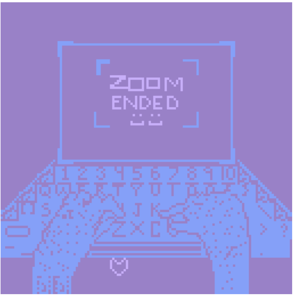
https://fr0gfartz.itch.io/feeling-weird
Electronic Media Studio: Introduction to Interactivity and Computation
60-210 • Spring 2021 • Prof. Golan Levin
https://fr0gfartz.itch.io/feeling-weird
Overall, I was very impressed by how creative people are with small pixels. I saw work that was completely different, and it was really cool to see how individualistic people were.
I really liked this project.
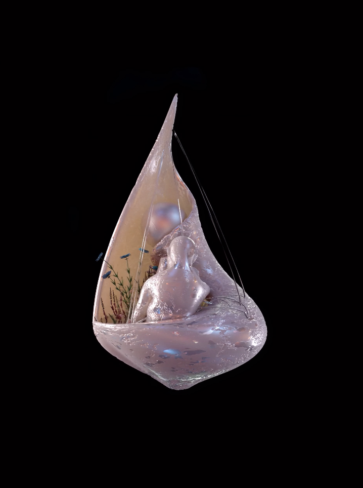
It was a story line of somebody mining a mineral and a woman appears in the stone. It was really fun and I felt like I was reading a book, with a pleasing aesthetic and interaction to go with it. The narrative was kind of long at certain points, but I enjoyed it because it was interesting to me that someone cared enough to put such a detailed dialogue. 
I am very against the NFT marketplace. This is not to say that I despise the artists participating in it to sell their work, especially if they are in financial trouble. What I despise is the people who created this marketplace, and are encouraging capitalistic structures so that they and their friends can become more wealthy. It is difficult to attain a sustainable and ethical job and live this way in the United States, especially for those affected by systemic racism, people who were born into poverty or are experiencing homelessness, etc. More capitalistic marketplaces mean that these people are even less able to support themselves, let alone think of how to address pollution (which primarily impacts the poor and poor countries that the US dumps our waste on). It means that the rich white men in a male-dominated industry (that is, 91 fucking percent) are continuing to profit off of deeply rooted sexism and systemic racism. It means these people are cowards and narcissists who cannot bear to face that the world sucks for most people. Instead, they retreat into their own privilege, which has catastrophic effects on the people that have been suffering.
I have elected to not participate in contributing to cryptocurrency trading, as I feel that the only moral justification for doing so is being financially helpless. Every acquaintance I’ve spoken with about cryptocurrency (which are all financially stable males) have never once mentioned the disastrous effects of it (because they are not affected by it, and don’t care). I know that they would definitely do this, so I will do the opposite of what they would do. 🙂
I don’t have anything against anyone in this class if they participate in this because I know that you people and most artists care about things <3.
(no name), title: beegoonkee, I love these spiders!!! I can tell that so much went into perfecting the behavior of the spiders.
Mark Malta, Ringlight, this guy is super cool.
Gustavo Torres, Shelter iii, love the concept of loneliness being explored in digital art.
Paola Castillo, The Promise, I like the flatness of the scenery in this piece.
I’m noticing that hic et nunc has the best art. It seems very intricate and that people are being innovative for the sake of expanding the possibilities in art. A lot of it is even interactive or has music! Which to me shows greater care for the work like this or this. Although not all of it is like this, and a lot of it is just meh, it still feels like even the meh art is made by people who care about art and are having fun( Example). I also noticed that a lot of them weren’t for sale, which in a way is nice to see because it shows that people are primarily interested in sharing their work, though I think it would fine if they sold it too.
A lot of the foundation work seems to be “show-off” vibes without containing actually cool art. Here are some examples of what I mean. However, maybe I feel this way because I believe that this site is unethical and so I am more critical of their work. However, I really like this artist and piece (before seeing the description of who they are, which is Russian art activists who were put in jail for anti-Putin riots). I like that they are making money towards something and it made me enjoy their art a lot more after the fact as well. I think that this site has a lot of really cool stuff, it just irks me since a lot of these people are wealthy, they have the capacity to make more advanced art than possibly somebody without their amount of wealth. It also makes the art inaccessible to non-wealthy people, since a lot of it is sold for a lot of money. Meaning, the rich are getting richer and the poor are not exposed to this work. Even if you are not planning on buying anything, it could still make people who can’t afford to buy the art feel excluded.
This website feels like a lot of the work is just kind of pointless. A lot of it is not exciting or impactful in any way. (Example) And then there’s just bad visual stuff that just looks half-assed like this. However, there are some really good pieces interspersed with the bad like this.
I’m really happy someone wrote this to expose more black artists, who are very much under-represented in the art world. I wish they selected more artists so that I could look at more of these artists. However, I’m noticing that these works are not similar to the other really elaborate pieces on the foundation website, which use cgi and other software. On this page, most of the artists are using software that looks not as current or as advanced as other works on this website and are not interactive or mobile( https://rarible.com/paola ). This may be intensional, as the artists may just like painterly art, but also might be due to the fact that black artists don’t have the same financial benefits as white artists due to systemic racism, leading them to have less accessibility to expensive software which fucking sucks.
You can find my code here.
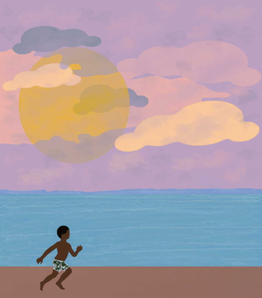
Here is a photo of my piece.
Here is a video of my piece.
Screen Recording 2021-03-17 at 2.21.33 PM
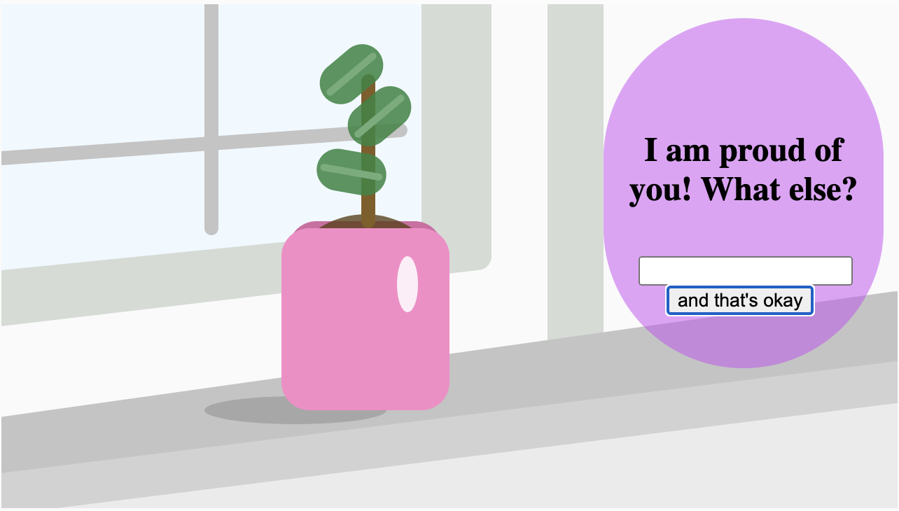
I created this plant as a self-help activity. It is basically like a to-do list, but instead of writing things down that you feel good about doing in your day and not writing things down that you’re ashamed of doing in your day, it just accepts whatever you did during your day and shows you a growing plant.
Here is my project.
My Sketch:
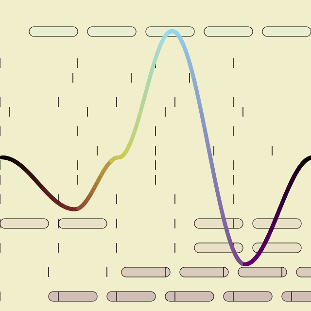
This project helps people get through the end of relationships, or reflect on relationships that have ended. It is also an instructional drawing. One can reflect and watch a conceptual version of their relationship by watching a line move on a screen, changing color, which will hopefully invoke an emotional response.
Relationship Tracker
| date: | Jan 8 | Feb 2 | June 3 | March 5 |
| happiness: | 10% | 50% | 70% | 20% |
I feel like I succeeded in the idea of the project, it meant something to me and I think that I channeled those feelings in order to execute the idea. I think the most obvious shortcoming is that the piece is not on an actual website, which I would like to have more activities than just this one, and it is not yet interactive.
I really liked learning about the differences between HSL and RGB because I think both can be advantageous for different types of projects. It’s also fun because as an artist who already understands color theory, it’s something that I can play around with efficiently. As for the Tyler Hobbs article, I got a lot of great inspiration on how to use color generatively. I particularly love the look of the “compositional shapes” design. (attached)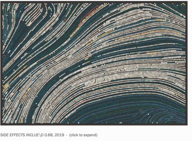
Here is my code.
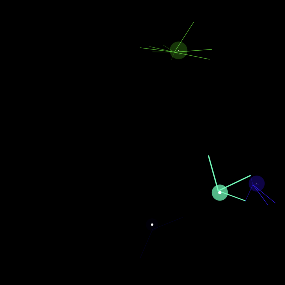
I’m really interested in this piece by David Whyte because he is using dots to indicate form and movement. It seems that this process is so minimalist and obvious, but it creates such an illusion to the viewer and I really like the 3D aspect of the balls in the middle.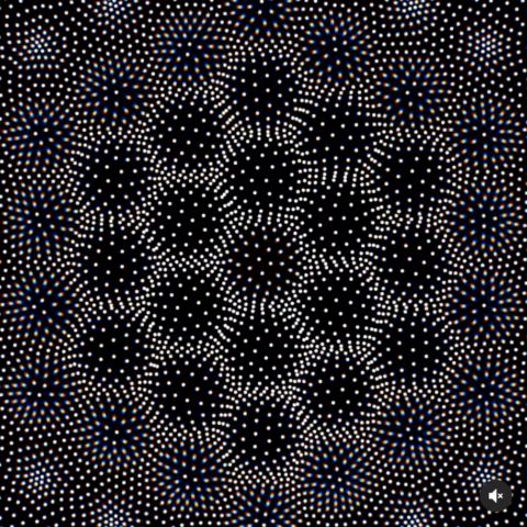
 I really enjoyed this video. My favorite part of Groeger’s video was the inspiration I got after viewing it because she gave all sorts of ideas on how to draw the viewer into work using loops. One of those ideas was that it’s much easier to tell differences when something loops versus if you are looking at two slightly different photos. I feel like this can be used advantageously by subtly changing things so that they are just noticeable.